Assessing the Usability of an Online Cannabis Marketplace
The focus of this project was to assess the usability of the Leafly website and to provide specific design recommendations to improve the user experience.
How can we improve access to medical and recreational cannabis?
Problem
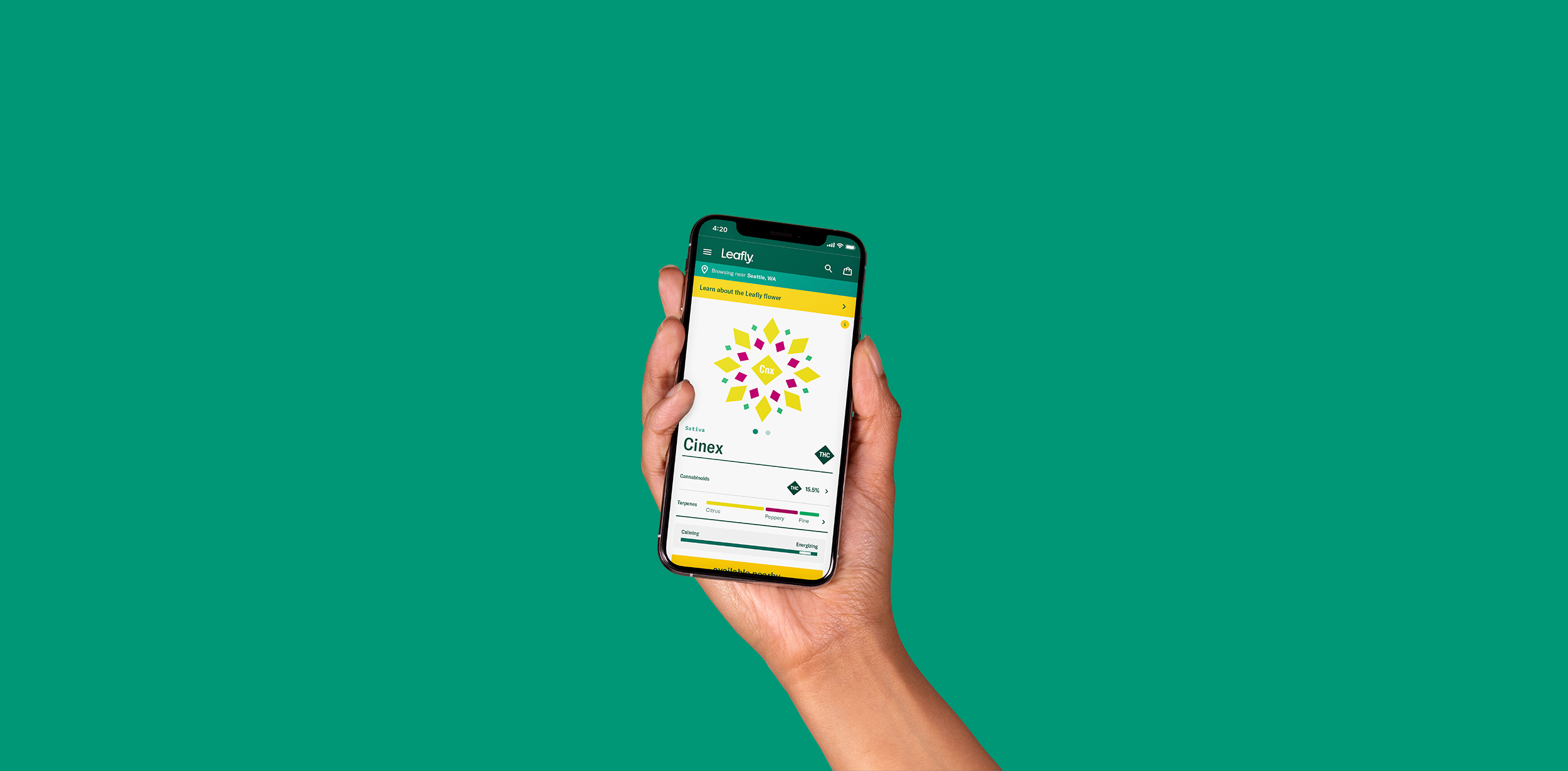
The Leafly website is an online destination to learn about, find, and order medical and recreational cannabis products. Our team conducted a series of evaluations to identify existing usability issues and provide specific recommendations to improve the user experience.
Details
Role: UX Designer and Researcher
Methods: Cognitive Walkthrough, Competitive Usability Testing, Heuristic Evaluation, Usability Testing
Tools: Figma, Maze

Methods
Findings
Heuristic Evaluations
Our team conducted individual heuristic evaluations of the Leafly website. As a team, we discussed our individual findings and developed a prioritized report and combined heuristic evaluation.
Cognitive Walkthroughs
Each team member identified one core task for analysis and conducted a cognitive walkthrough.
Tasks evaluated:
Create a new user account on Leafly.com
Request an appointment with a doctor to obtain a medical card
Find a dispensary in a specific location on Leafly.com
All steps of each task were evaluated using the following questions:
Will the user try to achieve the right effect?
Will the user notice that the correct action is available?
Will the user associate the correct action with the effect to be achieved?
Will the user see that progress is being made toward the solution?
Successes and failures with supporting reasoning were recorded for each question. After completing our walkthroughs, we evaluated each walkthrough as a group. Finally, we participated in several rounds of discussion and analysis to summarize our findings and recommendations.
Usability Testing
Through our heuristic evaluations and cognitive walkthroughs, we determined that the usability issues uncovered may have a negative impact on the experience of users attempting to purchase products. Based on this finding, we focused our usability tests on assessing how easily and efficiently novice Leafly.com users could find and purchase products. Our goals were to identify any usability issues users may encounter while buying products on Leafly.com and provide associated recommendations for improvement. To fit within our time constraints, we focused our testing on the desktop version of Leafly’s website.
Competitive Usability Testing
Our team also conducted a competitive usability test of Leafly.com and Weedmaps.com to identify users’ ability to successfully find dispensary hours of operation utilizing the dispensary map on each website. We collected data, including participants’ time on task and participants’ difficulty rating of the task. Our goal was to answer the following test objective through our collected data: Can participants quickly and easily find the hours of operation of a designated dispensary?
Based on the usability tests conducted, following is an abbreviated list of findings and recommendations to improve the usability of the Leafly website.
Finding
Some participants did not notice the “change location” link at the top right of the global navigation due to its relatively small size and location. Participants expected to be able to change their location within the dispensary map.
Recommendation
Make the existing link to change location more prominent. Add the ability to change location within the dispensary map sidebar.

Finding
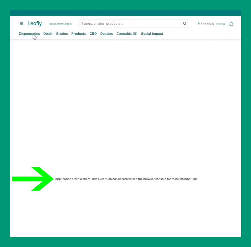
Two out of four participants encountered an error while trying to change their location that prevented them from continuing to use the website and did not provide instructions regarding how to proceed.
Recommendation
The language in the error message is targeted towards developers, which is not helpful for a typical Leafly user, who may not understand what the error is. The error message should be rewritten so that it is understandable to the average user and assists users in how to proceed.
Finding
Participants expressed confusion and frustration when they searched for a dispensary by location and realized they had to scroll past sponsored results to find the results relevant to their search parameters.
Recommendation
Move sponsored dispensary listings to another location or differentiate them in a more obvious way from search results so that users recognize them as sponsored results more quickly.

Limitations
We used static prototypes for testing so not all areas of the website were clickable for usability test participants. If I could conduct this project again, I would conduct the usability tests using live websites, rather than static prototypes. Doing this would provide more robust insights as users were only able to click areas that we enabled and could not freely navigate.
Next Steps
Conduct usability tests using live websites allowing for more robust insights to be captured
Broaden usability tests to include additional tasks and user groups