Redesigning a Major Modern Art Museum's Website
The Museum of Contemporary Art website (MCA) is a museum website where users can book tickets, browse exhibitions, and search museum programs about contemporary art in Chicago. The purpose of this project was to evaluate and redesign the MCA website’s information architecture to allow users to complete common tasks more intuitively.
How can we make this website easier to use to increase museum attendance, improve sales, and increase donations and membership purchases so the museum can continue its mission for years to come?
Problem
Users cannot easily find the information they need to plan a museum visit on the MCA website.
Details
Role: UX Designer & Researcher
Methods: Closed Card Sorting, Content Inventory, First-Click Testing, Open Card Sorting, Prototyping, Sitemapping
Tools: Figma, Mural, Optimal Workshop
Methods
Findings
Current navigation scheme is a mix of task-based and categorical
Content structure is confusing and difficult to navigate, making it difficult for users to complete key tasks
Navigation menu changes depending on page state
Site uses inconsistent language and terminology
Content Inventory
We assessed and cataloged all existing content (93 items) on the current MCA website to explore the logic of the current site structure. For the purposes of this project, we excluded content items from the MCA’s online shop.
Open Card Sort
Using the content items identified during the content inventory, we conducted an open card sort within our team to develop a potential organizational structure for the MCA website’s content.
Results
Renamed nine first-level content items to align with a task-based navigation scheme (Buy Tickets, Plan Your Visit, etc.)
Moved important second-level items to first-level items (i.e. moved “Become a Member” section out of the “Support” section)
Renamed 24 second-level items so that users could more easily understand the language used (i.e. changed “reciprocal privileges” to “membership level benefits”)
Closed Card Sort
We tested our task-oriented organization scheme and content categories with 20 users in three separate rounds of closed card sorting.
Findings
Users placed several cards in both the “Learn about the MCA” and “Learn” categories, which drew our attention to the fact that these category names were too similar for users to distinguish between.
Design Changes
Changed “Learn” to “Find Learning Programs” to more accurately reflect the educational content in that category and help users distinguish it from the “Learn about the MCA” category.
Results
Participants were more easily able to understand navigation labels. The task success rate improved from 38% to 80%.
First-Click Testing
We tested the validity of our mockup design by conducting first-click testing with 10 participants.
We asked participants to complete one common task visitors to the museum website might want to complete.
Task
Find upcoming event information.
Results
60% of participants successfully completed the first-click test
20% of participants clicked the hamburger menu, which was inactive for this test
Sitemapping
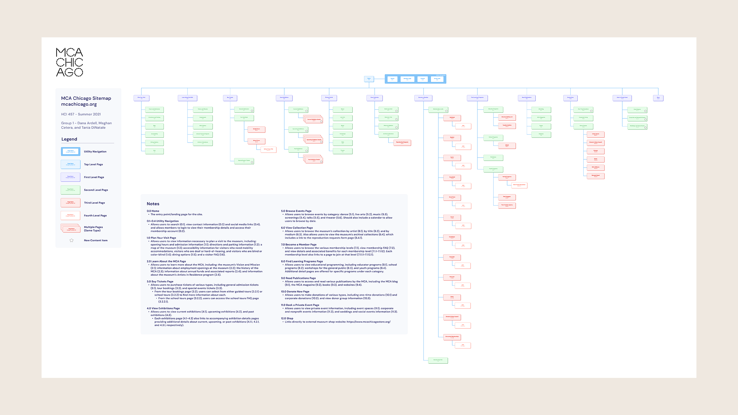
Based on the results of our previous testing, we created a sitemap to inform and document the content structure of the website and enable us to create prototypes for usability testing.
Results
Reduced number of top-level navigation items
Restructured utility navigation to reduce redundancies
Relabeled navigation items to improve usability and user satisfaction
Prototyping
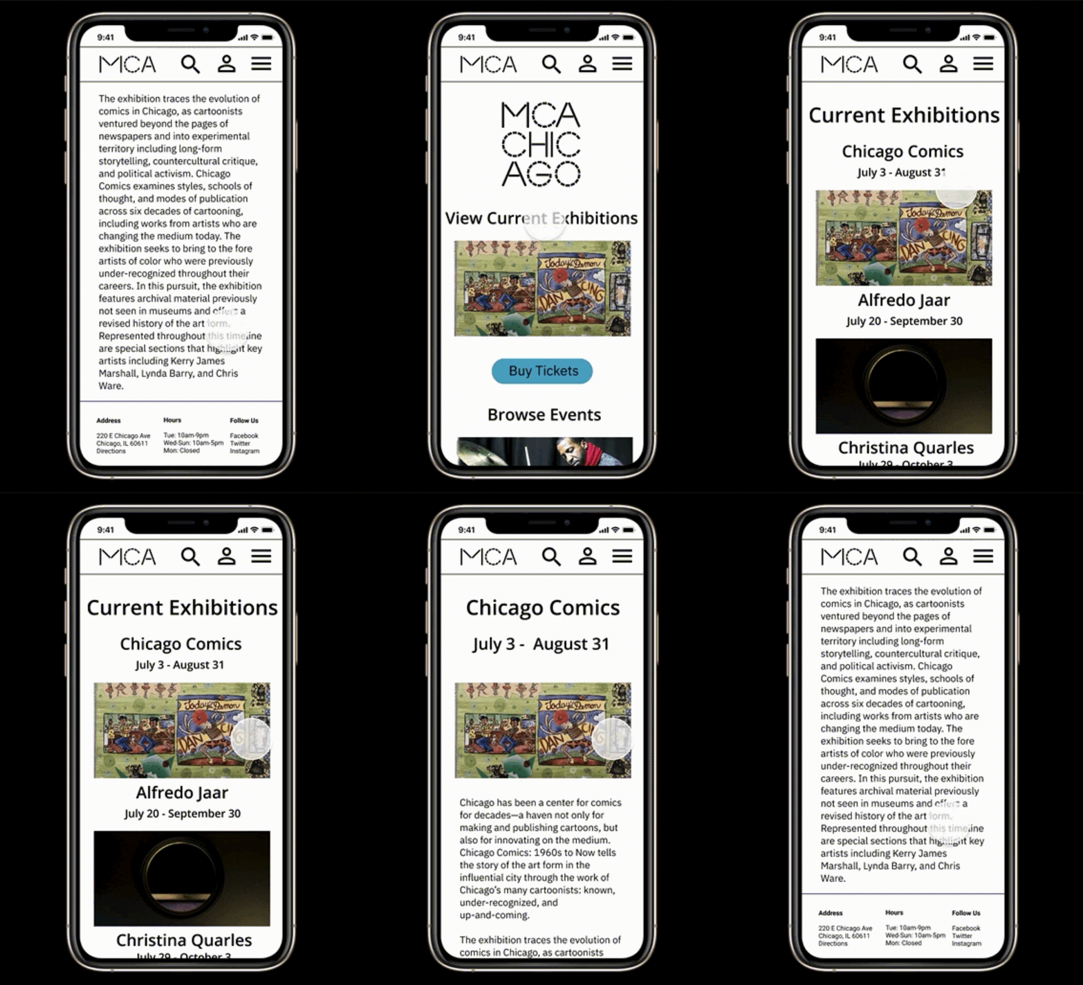
We used the sitemap to inform the design of prototypes used to conduct first-click testing to validate the information architecture of the MCA website on mobile.
Next Steps
Conduct card sorts to validate deeper levels of information architecture
Conduct usability testing to validate user flows and design mockups
Revise designs based on usability test findings and card sort results


